Signage can make or break your advertising:
a process for choosing ads
One of the most important aspects of your advertising campaign is choosing signage. This is because signage is one of the primary ways business owners can communicate with their customers. Signage can make or break your advertising.
There’s a beauty and complexity to signage. Some people devote their entire careers to signage–(hello!) Thankfully, this is well documented, so we have tons of online resources for signage.
This article is designed to serve as a starting point for helping you learn how to choose signage for your business. It will encourage you to explore types of signage and signage combinations beyond those you’re familiar with.
…
Identify Your Purpose
Before doing anything else, first identify the purpose of your advertising. What information do you want to convey? What is the medium for your advertising?
Good advertising aligns its signage with its purpose. This is because signage is key to setting mood, tone, and style in your advertising design.
For example, if you are advertising a business for traveling postcards or greeting cards, choose signage that can take advantage of the illustration-heavy graphics that some of your cards (or products) may use.
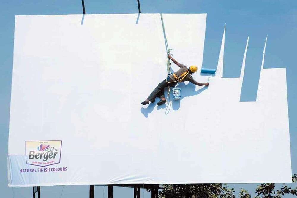
Or as another example, sometimes using lots of white space can be used to communicate your message too. (Even for large format advertising such as billboards!)
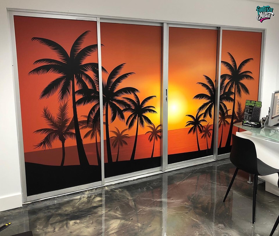
For storefront signage… if you’re advertising a business with large and open windows out front, you can use imagery of your products or the mood you want to convey. Choosing simple signage will not detract from your images, like the window vinyl we installed, seen below:
Identify Your Audience
Leverage professional design to emphasize information to communicate meaning to your audience. After determining the purpose of your advertising, identify your audience.
This step is crucial because information about your audience such as age, interests, and cultural upbringing could influence the decisions you make for you advertising.
For example, some signage is more appropriate for outdoors. With the temperature rising in Florida due to the Sahara wind gusts in June 2020, there’s signage that would withstand the heat better and longer. A good example of this is 3D Signage. Three-dimensional signage is developed for exterior storefronts and is designed to thrive for many years.
Other signage options are more appropriate for indoors. Indoor-friendly signage are temporary signs like A-Frames or luxurious frosted graphics.
Look for Inspiration
Look at other signage uses in Miami. Try to understand how the decisions were made for their advertising.
Signage Inspiration
For signage inspiration, these are the Best Signage Options for Miami. This is a great article to put you in the right mindset for choosing signage. In each article, Fantasea Media explains the motivations for each piece of advertising.
Another useful article is InspirationFeed’s Signage Ideas. Scroll down for a huge collection of images and you’ll find lots of inspiration there for your advertising campaigns and signage options.
Tip 1: Signage Visibility
There’s a rule of thumb for the wording on your advertising signage. For every distance of 10 feet, the height of the lettering should be at least one foot.
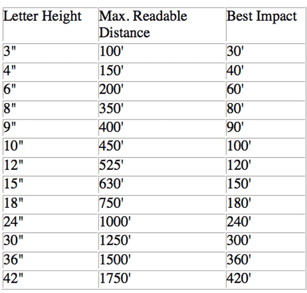
Tip 2: Signage Readability
When choosing outdoor signage, consider the typical speed of the nearby traffic; 20, 40, or 50 mph. Added clutter would make it harder for those passing by with speed to absorb all the information.
Tip 3: Signage Location
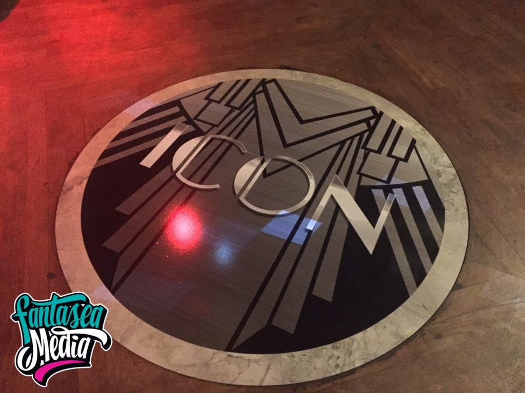
The line of sight to your signage should be visible enough and clear. What’s the point in investing great amounts in your advertising when your banner is hidden under electrical wiring or too-bright lights?
When signage is placed outdoors, defining the precise angle for placement is important. Signage that is placed parallel to the flow of traffic will go unnoticed. Align the signage to face the flow of traffic, at an angle between 45 and 90 degrees.
Advertising signage like lawn signs, banners, and billboards need zoning and lease requirements verified before placement, but what about inside your business location?
Point of Transit
This place is mainly concentrated on people who are on the go or in a hurry. Signage placed in points of transit should be clear, simple and effective. Content should be very precise, with seven words or less, and to the point.
Point of Wait
When your customers are waiting to be called or in line to buy, the main goal is to entertain your waiting audience. This signage should distract the customers from boring queue lines, so it can include longer text and more graphics to capture the audience.
Point of Sale
Graphics and signage placed at the point of purchase should encourage your buyers to return. Strong emphasis on the sale or discounts to come, or usage of strong catchy words will largely promote your business. (And all the information must be readable within the time it will take for the sale to go through!)
Tip 4: Scaling for Size
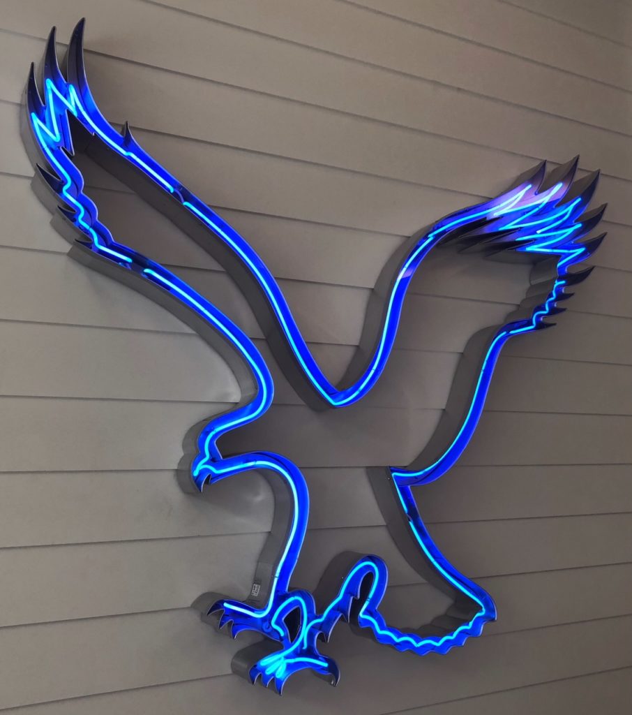
Take into consideration where the signs are going to be placed. Entrance to your business location or a parking lot? A professionally designed logo can be scaled down to fit any appropriate signage.
If letters are to be included, the letter visibility is obstructed when the design is overly styled or has inefficient spacing. The human eye is a powerful tool to detect all imperfections–with or without training in professional design, everyone knows what beauty looks like. That being said, after consulting with some professional designers, perfect size, appropriate scale, and precise spacing of letters all make prominent key factors for a classic design.
Tip 5: Your Brand Colors
Eyes perceive colors first. And first we turn to your Brand’s Trademark. Your logo is highly significant, as it serves as the graphical anchor for the fonts, colors, and design choices in your signage and all your company’s marketing materials. (Fewer colors are better.)
Tip 6: Reading At A Distance
Choosing the correct signage design is important since it is key to marketing at a distance. Design includes not only colors, but font choice. Professional designers know that heavy fonts will blend together and disrupt the entire visibility of the entire piece of marketing material.
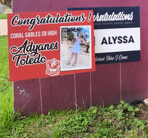
It is a common misconception that depicting all texts in signage using all capital letters increases visibility–quite the opposite; using them complicates and strains the eye, essentially collapsing the entire structure of readability.
Tip 7: Signage Effectiveness
Flooding your signage with too much information, too many font options, or too many colors makes it look cluttered. In order to make impressive signage… Keep it simple.
Fewer Words, Greater Understanding
Less Is More — The general rule of thumb is that a business sign should not have more than seven words to maintain effectiveness. Studies say at least for optimal readability, 30%–40% of your advertising signage should be left as white space: the area that is left uncovered by graphics and text. Adding more words than the minimum count makes it difficult for your customers to read the sign with full understanding (and distance makes it even harder).
Tip 8: Emphasize Your Brand
Today’s market has huge competitors competing for the same audience. To make a higher impact than your competition, make your brand unique and distinguished from others. Carry out a unique representation in your brand and signage. Who are you in the market?
Tip 9: Signage Refresh
Keeping the same signage for long periods of time eventually stops gaining peoples’ attention. But recreating your signage over and over after a while would get tiresome. Apply modifications to existing signage to keep it fresh and lively. Using the latest tech is always impressive, and changing up the layouts or images gives the fresh new look you’re aiming for.
Tip 10: Signage Materials
Click here for a full list of signage materials and their suitable uses. Creating beautiful signage takes experience and dedication. Deciding on choosing the appropriate material shouldn’t be a hassle and, should you need us, we’re here to help.
Advertising is all about experimentation. It’s both a science and an art.
Looking to hire an agency?
If you wish to discuss how we can develop your brand or provide graphic design for your product or business, email us: info@fantasea-media.com
Fantasea Media is a Print & Digital Advertising Agency that specializes in effective Graphic Design, Signage, and Web Design.
Facebook: /fantaseamediainc Linkedin: /fantasea-media Instagram Portfolio: @fantasea_media Promo: @fantaseamedia
Written by Victoria Zade
Victoria is a writer, SEO analyst, consultant, and designer who transforms businesses through graphic storytelling to business owners, artists, professionals, and visionaries. • www.vzade.com
Schedule a private call to discuss how Victoria’s strategy, graphic design, and copywriting will transform your organization.
